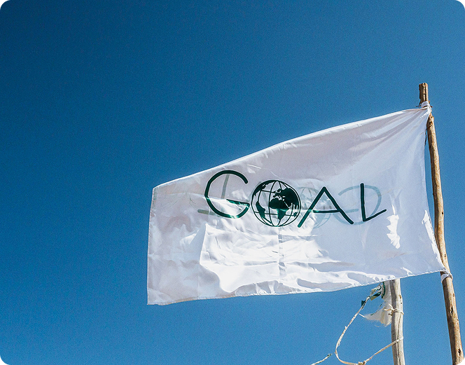
GOAL Global
Redesigning the digital presence of one of Ireland's most recognised humanitarian organisations — and beginning a decade-long creative partnership.
/ The Challenge
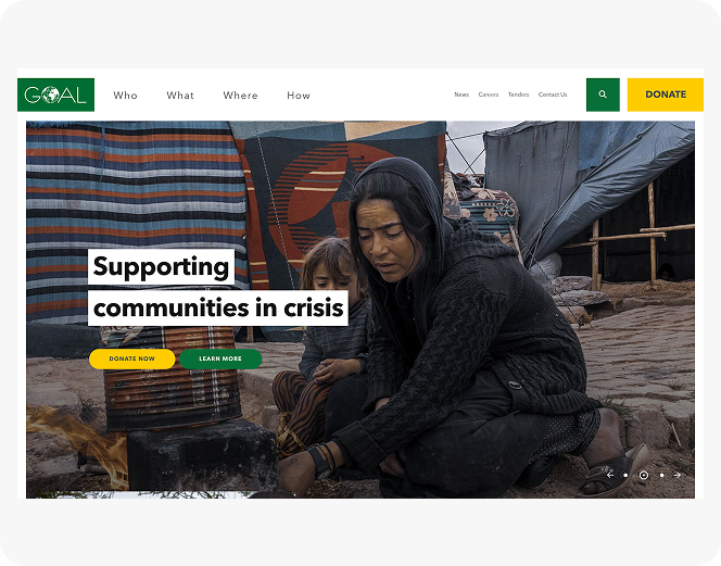
A platform that had to earn trust in seconds.
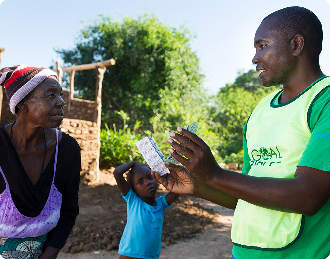
Founded in 1977, GOAL has responded to almost every major humanitarian crisis in the world over the past five decades — operating across 14 countries with the support of governments, the EU, the UN, and hundreds of thousands of individual donors.
The existing website was failing on every front. Visually outdated, technically strained, and built on a CMS that the communications and fundraising teams had largely outgrown, it couldn't support the pace at which GOAL needed to publish, campaign, and convert. The donation flow was friction-heavy and the information architecture made it difficult for users to understand the breadth of GOAL's work on the ground.
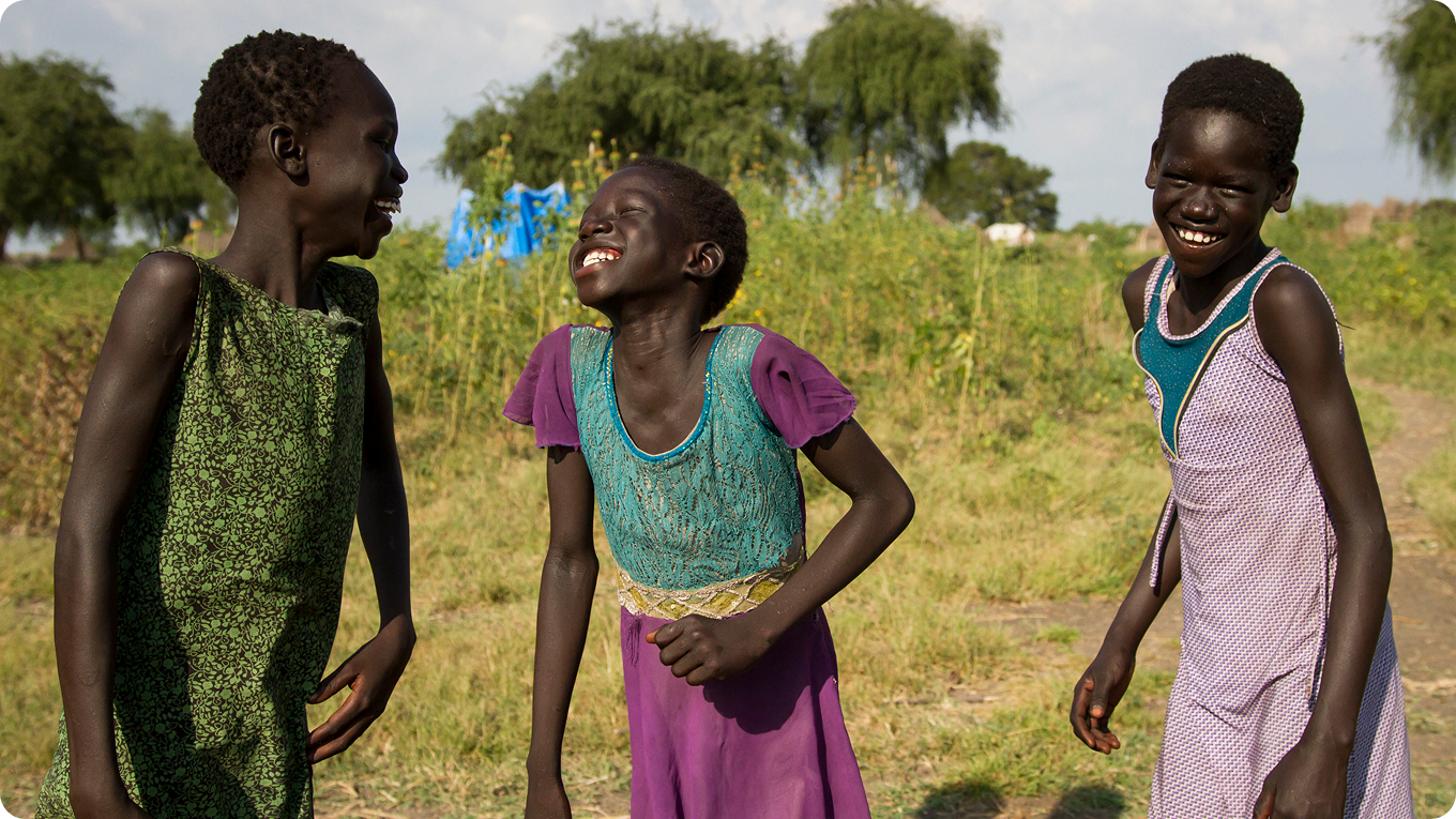
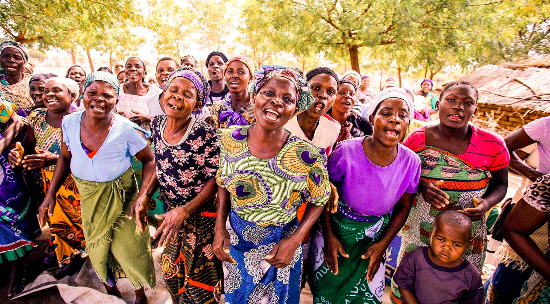
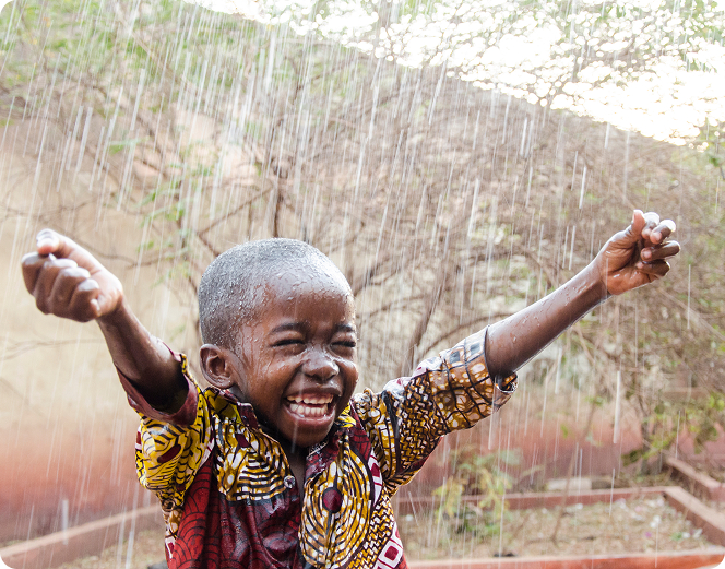
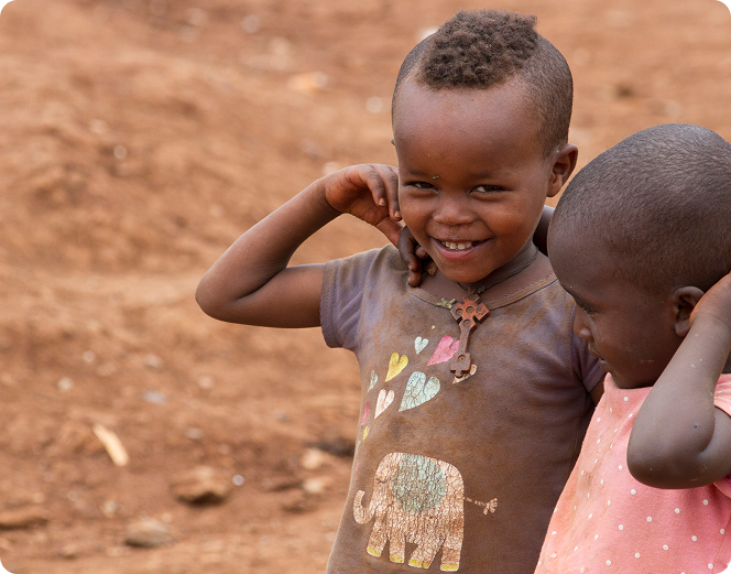
The brief was precise: build a platform worthy of GOAL's global reputation — one that made donating simple, made the work visible, and gave internal teams the tools to move fast without depending on developers. One constraint shaped everything: the creative direction was always about the positive. Never the suffering. The work would show what GOAL was achieving on the ground — not the conditions that made it necessary.
/ The Solution
Discovery first. Design second.
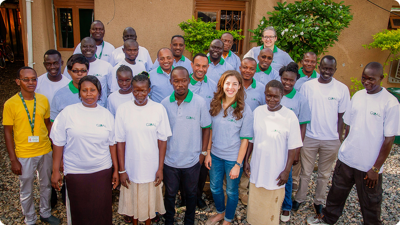
The project opened with a focus analysis group reviewing GOAL's existing digital presence — surfacing the specific friction points users faced when trying to find information or donate. This was followed by a structured discovery workshop with key GOAL stakeholders: management, marketing, communications, and fundraising teams. Towards the close of the process, outgoing CEO Siobhán Walsh joined the session — a signal of how seriously GOAL were approaching the rebuild.
The most significant structural decision to emerge from that process was the simplification of the navigation into four key pillars. These weren't just a design choice — they mapped directly to how GOAL managed itself internally, and they gave users a clear, immediate sense of what the organisation did and where to go. Everything else in the information architecture followed from that. I led the full creative and UX direction from discovery through to launch — working with and leading the design team across every deliverable.
/ What I Delivered
A full digital platform — and a creative partnership that lasted over a decade.
This was a complete rebuild of GOAL's digital presence. The website was developed on a bespoke WordPress theme built specifically for the organisation — no off-the-shelf templates, no compromise on performance. The donation flow was redesigned from scratch. The legacy GlobalPay integration was replaced with a modern payment gateway, and the new flow was stepped and frictionless — designed to reduce drop-off at every stage, support both one-time and monthly giving, and handle the full range of GOAL's fundraising campaigns.
- Full UX Research & Discovery
- Focus Analysis Group Facilitation
- Website UX/UI Design
- Bespoke WordPress Theme Development
- Donation Flow Design & Payment Integration
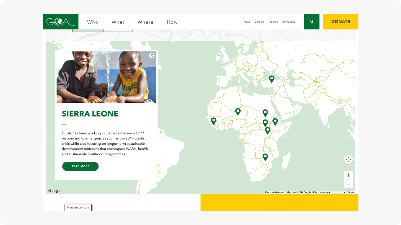
- Interactive Country Map
- Careers API Integration
- COVID-19 Impact Globe
- Advanced Search Function
- Campaign Page Framework for Comms Team
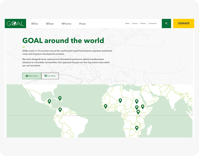
/ The Interactive Map
Making GOAL's global presence tangible.
The interactive map was part of the original brief — a way for visitors to explore where GOAL was operating and surface the stories coming out of each country. Each country entry linked through to a dedicated case study, turning a geographical view into an editorial one.
During the COVID-19 crisis, this was extended into a live impact tracking globe — a later enhancement I led the UX on, repurposing the existing map architecture to communicate crisis data in real time. The goal throughout was the same: make GOAL's presence on the ground feel immediate, specific, and human — not abstract.
/ The Longer Relationship
One project became ten years of creative work.
The website was the beginning of a sustained creative partnership with GOAL that extended well beyond the original brief. Over the following years I continued to support the organisation across a wide range of design and production work.
The GOAL Next Gen department became a recurring creative relationship — producing St. Patrick's Day campaign materials for social and live events throughout the festival period. In 2024 I designed infographics for GOAL's annual report. In 2025 I designed the full Annual Report — one of the last major projects before CEO Siobhán Walsh's departure.
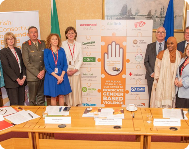
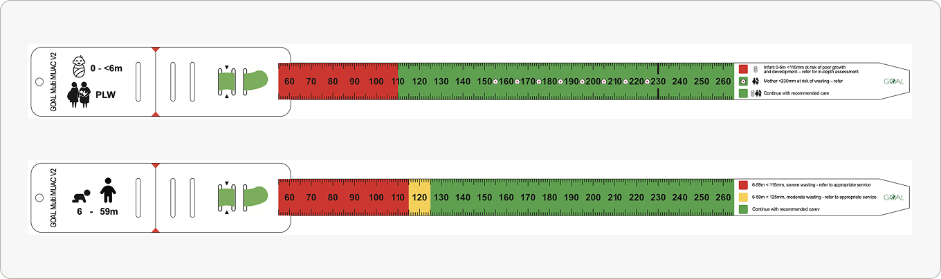
One of the most distinct pieces of work from this period was the design of a Multi-MUAC tape — a diagnostic tool used in the field to assess malnutrition in both children and adults. Designing something that would be physically used by aid workers in crisis environments, where clarity and accuracy are not a design preference but a life-critical requirement, was one of the most meaningful briefs I've worked on. Additional work included social campaigns, event materials, and a 2-metre high jigsaw foamboard for the Irish Consortium on Gender Based Violence.

/ Outcomes
A platform that held up — and a relationship that kept growing.